Wednesday 19 April 2017

[MORE] SURFACE TENSIONS: CURRENT WORK IN PROGRESS


Okay...so what happens when the piece you are working on, no longer looks any good, but isolated areas look beautiful? This piece has been constantly evolving - on and off - for two years. It's a 60 by 60 acrylic on canvas, and I don't know whether it's because of the size or proportions, but despite scores of revisions, it has never looked satisfactory to me. 


You've seen from previous posts that I am fascinated by what is happening on the surface of my paintings. I love holding a painting in my hands, and playing the light across it, reading it from side to side like an engraving, or a piece of lazer-etched nanotech, or a 3D topographical map. To me, they look like buildings, cities, or even worlds.


This is how minimalism probably started: Cameras got invented, and artists inevitably would document their work, focusing on details of interest, and then come to the same conclusion that I have - that the details look better than the actual painting.


I used various new techniques to get the paint to behave differently. I like to degrade the surface to keep it from looking too smooth. I want it to look both rigidly uniform, but weathered, like a piece of modernist architecture that hasn't been maintained.


I asked my studio colleague for her opinion the other day, and apart from finding the current colours 'revolting', she observed that it's not the composition that seems to interest me, but the lines on the surface. She said it's no longer a painting, it's an installation. 


I find that perhaps it's more like a sculpture, because I'm constantly attacking the surface with a knife, or peeling bits off, or waiting until the paint is like a kind of plastic cement, and trying to mould it.


Since these pictures were taken, the painting has changed again, which is why I won't show photos of the whole piece. And also because I assume people will find it as anticlimactic as I do.

i [ am a ] CAMERA

I was given an iPhone recently, to use as a music player. Then I discovered the camera...


Below: Mixing colours for my 'concrete' paintings.


I'm actually shocked at how good it is. In fact, this phone is better than my actual camera. The only thing that will prevent the iPhone replacing the old camera is because no-one at Apple has thought to attach a wrist strap for those tricky leaning-out-of-a-building shots.


Below: A police helicopter, hundreds of feet above the city. No rotor blur!


Below: Birmingham reflected on a communal hand-dryer.


Below: I love the design of this poster.


Below: The Typhoo Building ( near my studio ), where Spielberg filmed Ready Player One, last year.


Below: Birmingham UK, as seen from the Custard Factory.


Wednesday 5 April 2017

SPLITTING INFINITIES [ THE ABSTRACTION OF MODERN TRAVEL ]

Umberto Boccioni, the Italian Futurist, recognised the disconnected psychological, temporal and geographical phases that you experience when travelling. In his 'States of Mind' paintings, he acknowledged three distinct conditions: The Farewell; Those Who Go; and Those Who Stay. 

For me, travel represents nothing but the anxiety of alarm clocks, check-in deadlines, and air turbulence.Therefore, when I have to catch a plane, I will not eat or drink all day, as I'm too paranoid about being in an air crash on a full stomach. Starvation over a long-haul journey inevitably sends the body into shock, and therefore heightens the sense of disorientation, terror, and paranoia. Only when I have achieved this ideal state, do I start thinking like a true artist.


Despite all the negative aspects, travel can still be a pleasure. For example, I'm a huge fan of Switzerland. I love how it's so clean: Clean houses, clean lawns, clean towns, clean mountains. They even have clean air. I go there at every available opportunity, sometimes even for three hours at a time.

The pictures in this series represent another possible addition to Boccioni's 'States' - The Stop-Over.


Source of inspiration, below: Zurich Airport's sparkling concourse and lines of perspective.


My point, is that disorientation inevitably leads to abstraction, and when that occurs you must seize the opportunity to record it.


So, when deciding on a new 'wallpaper' design to go in the background scroll of my pop-culture blog, I remembered all those shiny surfaces in Zurich airport's concourses, and thought that they might be appropriate. For the current edition of my blog, I wanted something dystopian, robotic, sinister and Ridley-Scott-looking.

I have a folder of 'real-life abstract photographs', and I used repetition to see what effects I could achieve. 

Note: No other CG techniques were used. These are unretouched photographs, simply cropped, flipped, and repeated.


Below: One of my first Zurich Airport abstracts, from 2012.


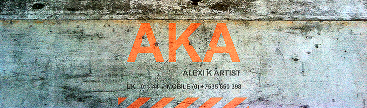
Below: Back in 2012, I must have photographed this logo as a possible inspiration for a future 'Alexi K' logo.


The only thing that bothers me about flying, is being up there and suddenly not flying.


An example of Financial Abstraction, below: 
Hide your billions from your government, and celebrate your good fortune by eating chocolate gold out of a miniature vault.


/////////////////////////////////////////////////////////////////////////////////////////////////

Below: The Alexi K 'Smiley Man' logo, inspired by the old Swiss Air 'box logos'. I was aiming for just the right amount of corporate and frivolous.


MORE ABSTRACT LIFE

The best examples from my photo diaries, and more. Click on the links, below. 


Fried Brexit ( also, see June 2016 for all Brexit art )